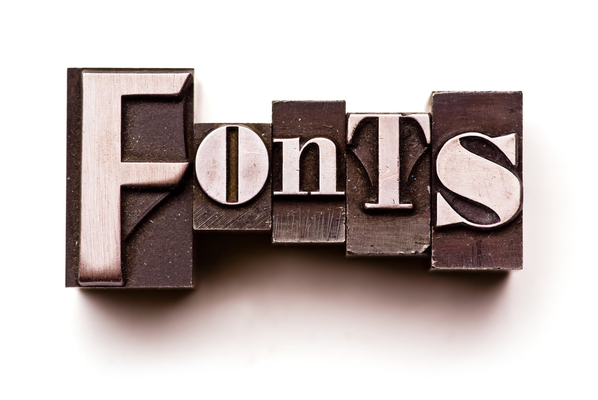
Tips and Tricks on How to Choose a Logo Font
Are you currently making a logo for your business or company? During the process, picking a good logo font can be the most difficult and exhausting process. There are just so many to choose from.
To help you out, we’ll tell you the best ways to ensure that your logo font is the perfect fit for you and your brand. Let’s jump in.
Understanding the Basics
If you droned off during typography lessons or don’t even know what typography is, we don’t blame you. Typography is just the style of text, written materials, and now websites with text. It isn’t the most interesting topic on the planet.
While there are some nitty-gritty aspects of typography to look into like kerning and leading and general aspects of graphic design that influence typography like visual hierarchy, we’ll hone in on the fundamentals. The most important part of your logo font picking process is to settle on what type of font you’ll be using.
Generally speaking, there are four different types of fonts:
- Serif
- Sans-serif
- Script
- Display
Serif and sans-serif fonts are what most would refer to as “normal fonts”. Serif fonts are most often used in printed material like books and newspapers. These types of fonts have those small lines at the end of each end of a letter.
Sans-serif fonts are different only because they don’t have those small lines on any of the letters. These are mostly used in digital media because it’s easier on our eyes on screens than a serif font would be. A prime example sans-serif font would be Arial, which is the default for almost every word processing program like Microsoft Word or Google Docs.
Generally speaking, you’ll only be working with these two font types. Script fonts, also deemed “fancy”, “handwritten”, or “cursive”, should really only be used for weddings. Display fonts are literally every other type of font that is special and not in these other three types. The Star Wars font is a display font as are the old Jokester or Chiller fonts.
Brand Identity
The reason for not using script and display fonts is because of brand identity. Brand identity is what creates your brand image. This image is what your customers, competitors, and potential investors will perceive your company as.
So if you opt to go with the Harry Potter font for a funeral service business, your company isn’t going to be taken seriously. Picking a professional font that is clean, but that also reflects the meaning of your company will draw in your target audience. Even if you have to hire someone to design your logo font, just make sure it accurately reflects your brand and it follows the golden rule…
Keep it Simple!
Keeping it simple is the last step to picking a great logo font. If your logo is messy or too busy, you’ll turn people away. That’s not good for business.
Just stay away from using more than one font for your logo. If you deem it absolutely necessary to do so, make sure that it doesn’t exceed two different fonts and that each font is the same font type. So no mixing a serif font and then a script font.
Not only should your font be simple, but the actual design of your logo should be. They should also mesh and coexist so as not to create dissonance. Simplicity is the key to a perfect logo.
The Perfect Logo Font
Picking the perfect logo font isn't an easy task. You should take your time and ensure that you and your team like it and that it matches your brand identity. Most importantly: keep it simple.
If you liked this article, be sure to share it with those who may find it helpful. If you'd like to see more content like this, check out the rest of our blog.
Related Posts
-

5 Promotional Products South Carolinians Will Love
5 Promotional Products South Carolinians Will Love Your audience is ready for something new. It's time to get creati...
-

T-Shirt Design: 5 Popular Custom T-Shirt Trends You Should Know About in 2020
Here's the deal: the market for custom T-shirts is expected to hit more than $10 billion by the year 2025. Are you i...
-

Creating a Swag Pack: 4 Promotional Items Everyone Loves
You have a rare chance to put your logo in the hands of an influencer, but you can only hand them one object. Do you ...